The Retrain performance management system is aimed at companies looking to streamline and improve how they manage employee performance through Key Result Areas (KRAs). It was due to launch, but there were concerns with the UI. The product needed uniformity without completely altering all the components due to a nearing deadline, the goal was to improve UX/UI, streamline navigation, reduce visual clutter, and incorporate an onboarding process.
While working on the project I uncovered usability issues within their template creation function. I led the UX/UI redesign of the product, ensuring it remained consistent throughout while creating new components, improving UI, and the user experience. The redesign is currently being implemented by the development team.
%201.png)
The original Retrain platform presented several usability challenges. Without an on-boarding experience, users would need to rely on manual guidance. The interface felt visually cluttered and inconsistent, and the dashboard displayed dense, unfocused analytics. Creating a performance template was not intuitive, often requiring trial and error. Additionally, the payment plan options lacked clarity and visual hierarchy, making it difficult for users to confidently select the right option.
The primary goal of the Retrain performance management system was to create consistency and improve usability. Key objectives included:
Objective: Assess usability of template creation feature through qualitative research.
Task: Create a KRA template for an employee with 3 Areas and 3 Questions each.
Metrics: Task success rate, Time on task, Error rate, User satisfaction, Feedback.
The Results: 70% of users could not complete the given task. Users spent 8-15min on the task due to the need for trial and error, before figuring it out or asking for assistance. Each user made at least 7 errors before understanding what was required of them or asking for assistance. An average rating of 2/5 was given for the experience.
User feedback:
"I had trouble with the template creation, I didn't like that it required me to do calculations."
"I wish there was some sort of guidance or a better explanation of what I'm doing wrong."
"The weight is confusing."
Users gave valuable suggestions such as: Save button should be at the bottom, when adding an area it should have a blank Area and question open, error messages need to stay open longer.
Key Insights:
The previous screens lacked a consistent UI, had visual clutter, as well as some accessibility issues.
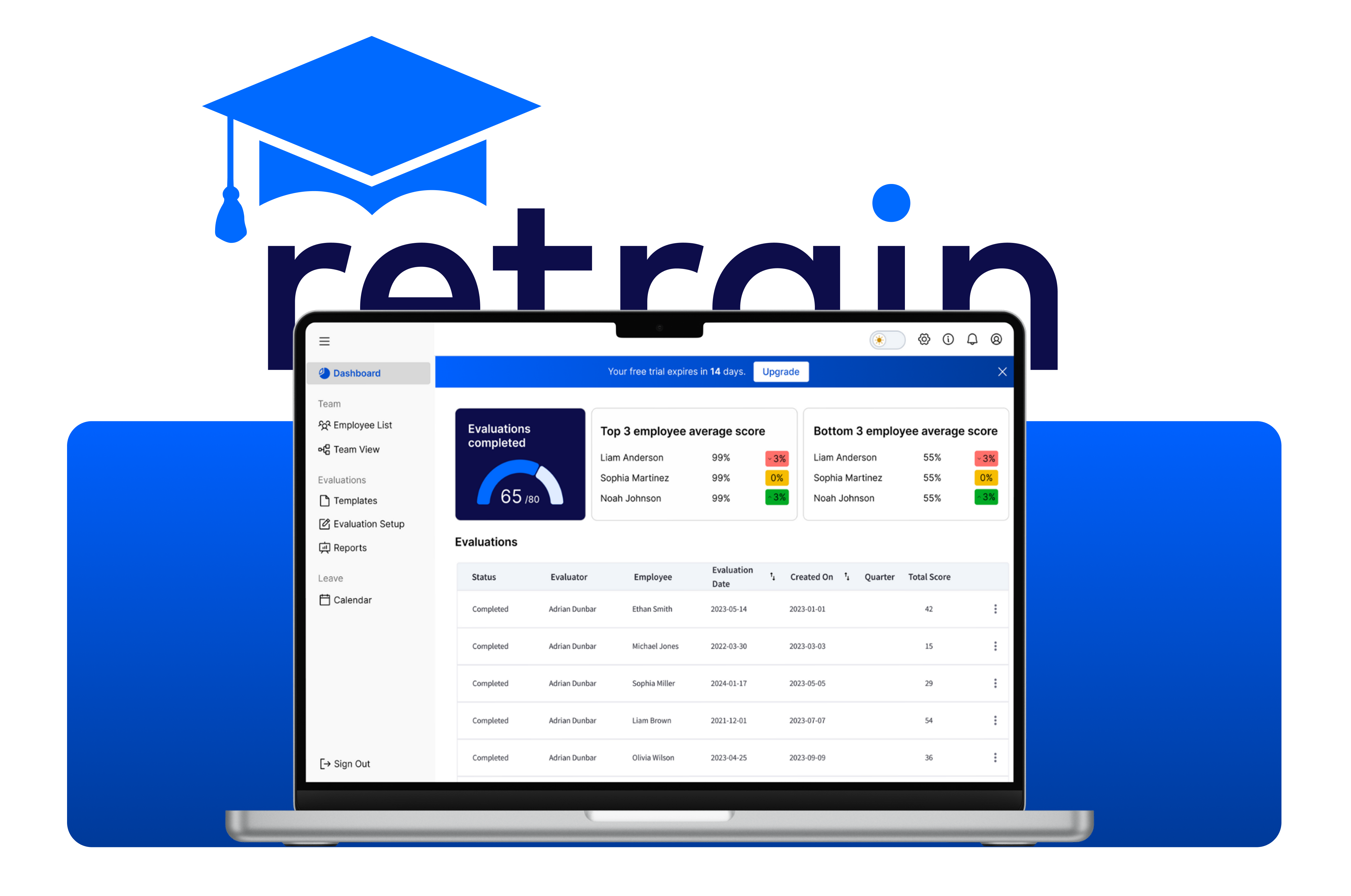
The dashboard - This was my starting point, as it serves as the user's first impression of Retrain. The original design overwhelmed users with excessive and unfocused analytics. In my redesign, I streamlined the data to highlight only the most relevant and actionable insights.
I introduced a modern bento box layout to organize the information clearly and make the interface more visually engaging. Throughout the process, I ensured the design remained consistent with the company’s brand color palette.

The Navigation Evolution - From left to right, you can see the progression from the original design to the final solution. The first and second iterations was an attempt to condense the initial layout, but after reviewing the user flow, I realized the constant expanding and collapsing of the side navigation was adding unnecessary friction. After discussing it with the developers, we moved the organization links to the top navigation to better support future scalability. To reduce visual clutter, I also grouped and categorized the remaining links for a clearer, more intuitive experience.

.gif)
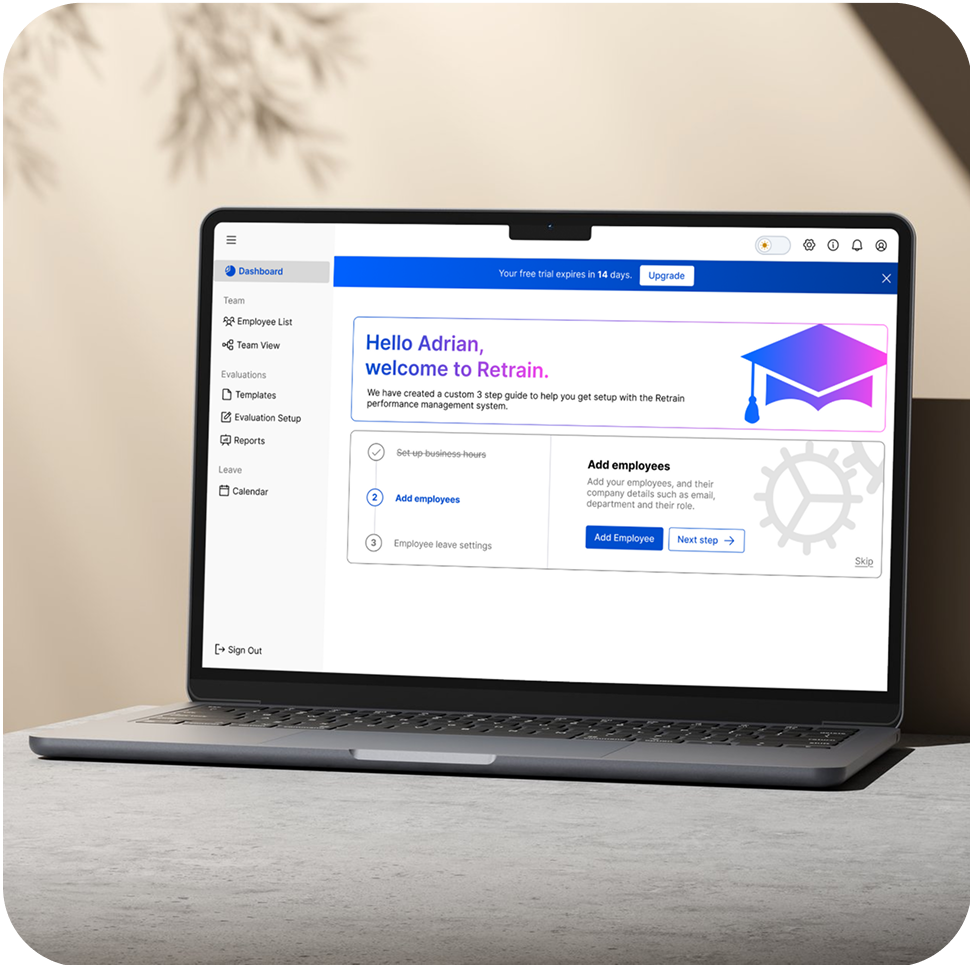
Onboarding- Initially, there was hesitation from both the Director and the development team regarding the implementation of an onboarding or walkthrough feature, primarily due to time constraints. They proposed deferring it to a later version (v2).
However, I strongly advocated for including some form of onboarding in the initial release (v1) to support user adoption. The Director responded very positively to this design and decided to include it in v1, even citing it as a favorite element of the redesign. The development team also approved of the simplified approach. This onboarding feature now provides new users with clear guidance and helps them confidently navigate the product by directing them toward their next actionable task.


Dashboard redesign- the dashboard became clearer and less cluttered with segmented data more informative and useful to the assessor. Analytics are displayed according to the user resulting in different displays for owners and employees. Colors more consistent with the brand were used instead to improve visual appeal.
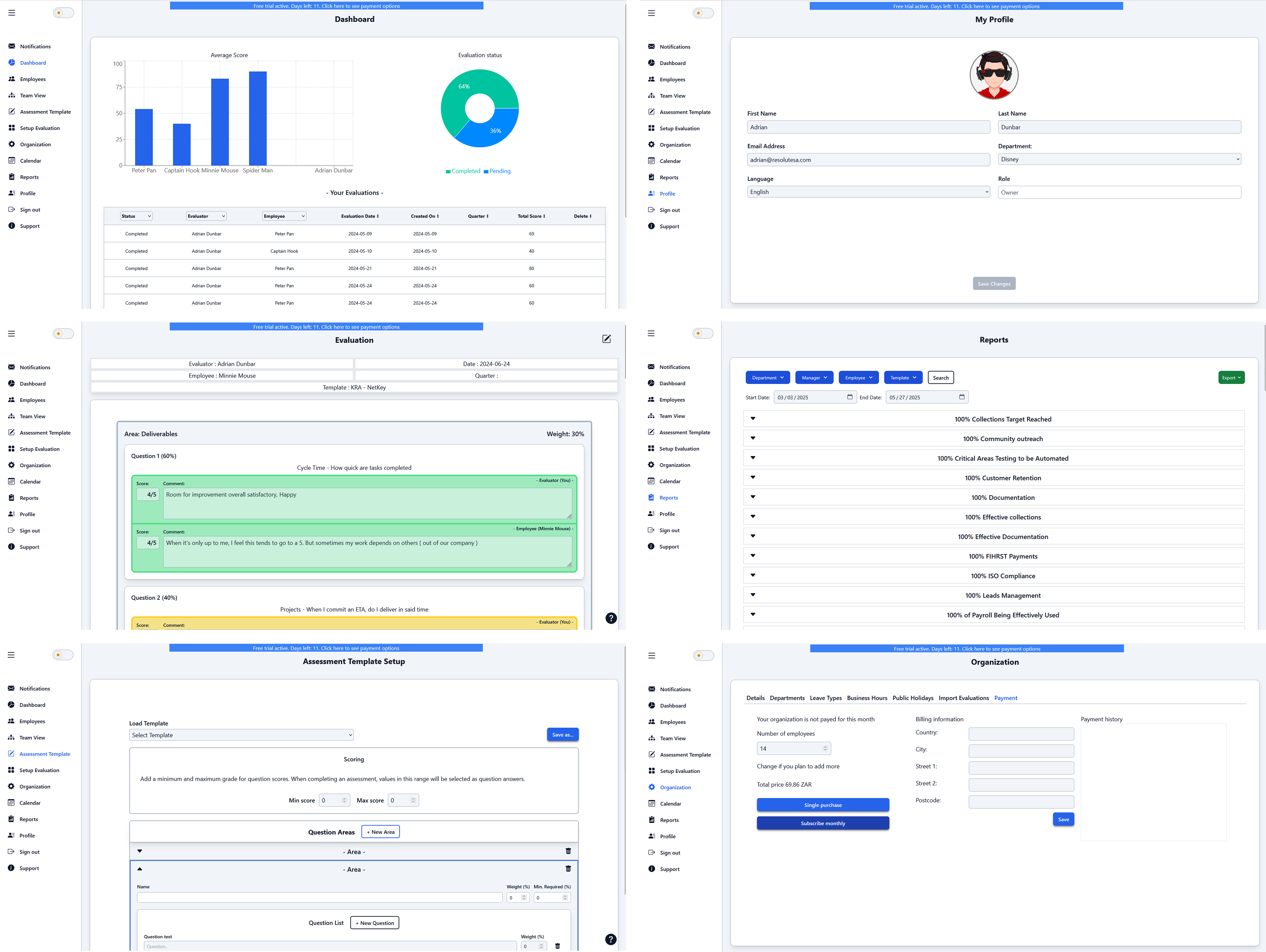
The template screen enables users to create a custom assessment template tailored to their company’s specific requirements and goals as well as edit existing templates. Informative text was added to set clear expectations, and secondary action buttons were strategically placed to reduce scrolling and improve overall usability.


Given that the templates feature was a major user pain point, it was prioritized in the redesign. Clear error messages were implemented to visually guide users to fields requiring correction. This is proof that even simple changes can make a big impact. After this redesign, 100% of users had a clear understanding of what was expected of them and were able to complete their task in a timely manor.
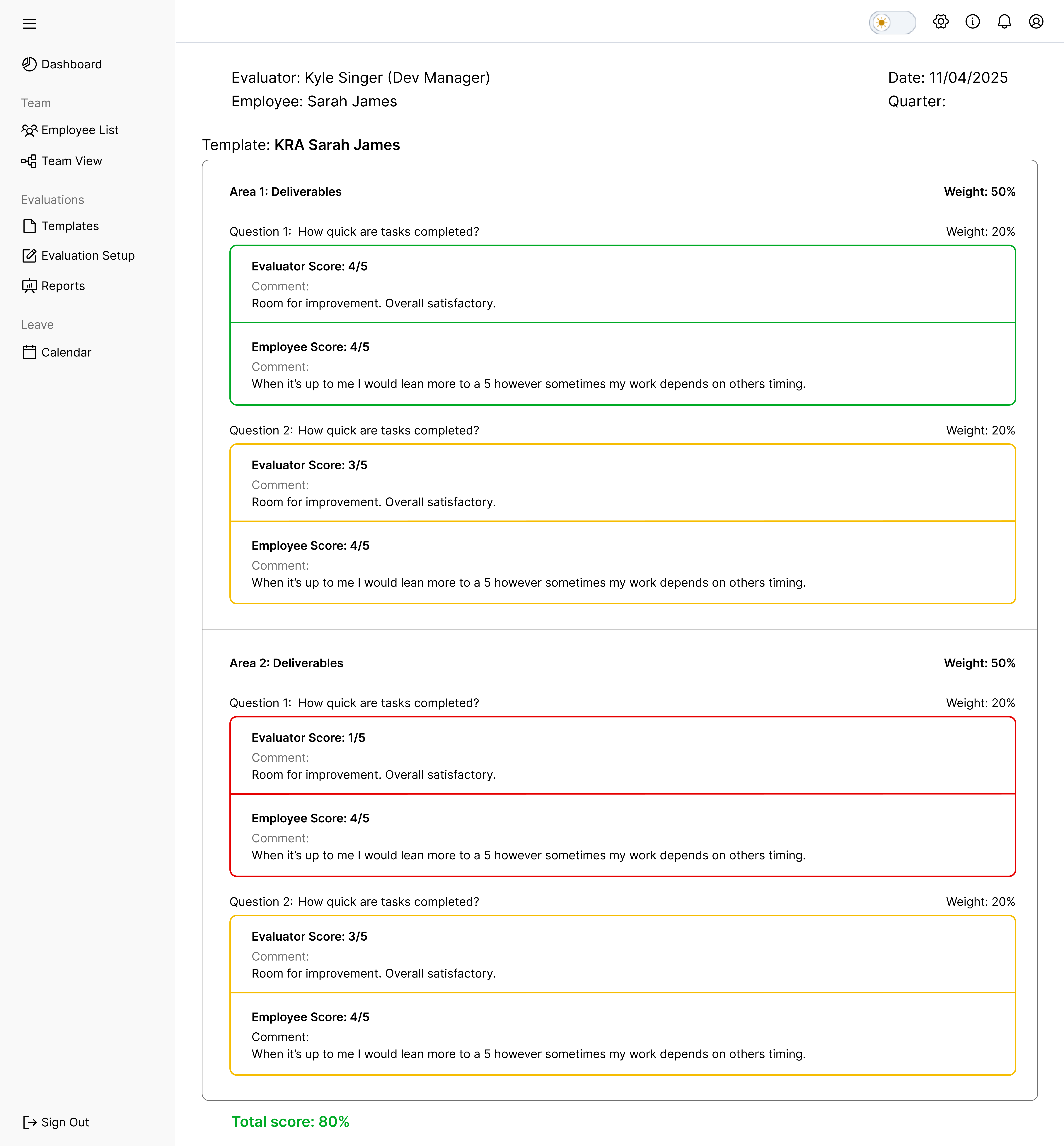
Evaluation results- The original screens were visually cluttered, which impacted usability and clarity. In the redesign, I focused on improving visual hierarchy and readability by leveraging whitespace effectively. I removed excessive borders and instead used spacing, bold typography, padding, and subtle lines to create clear visual separation between elements. Additionally, accessibility issues were addressed to ensure a more inclusive and user-friendly experience.
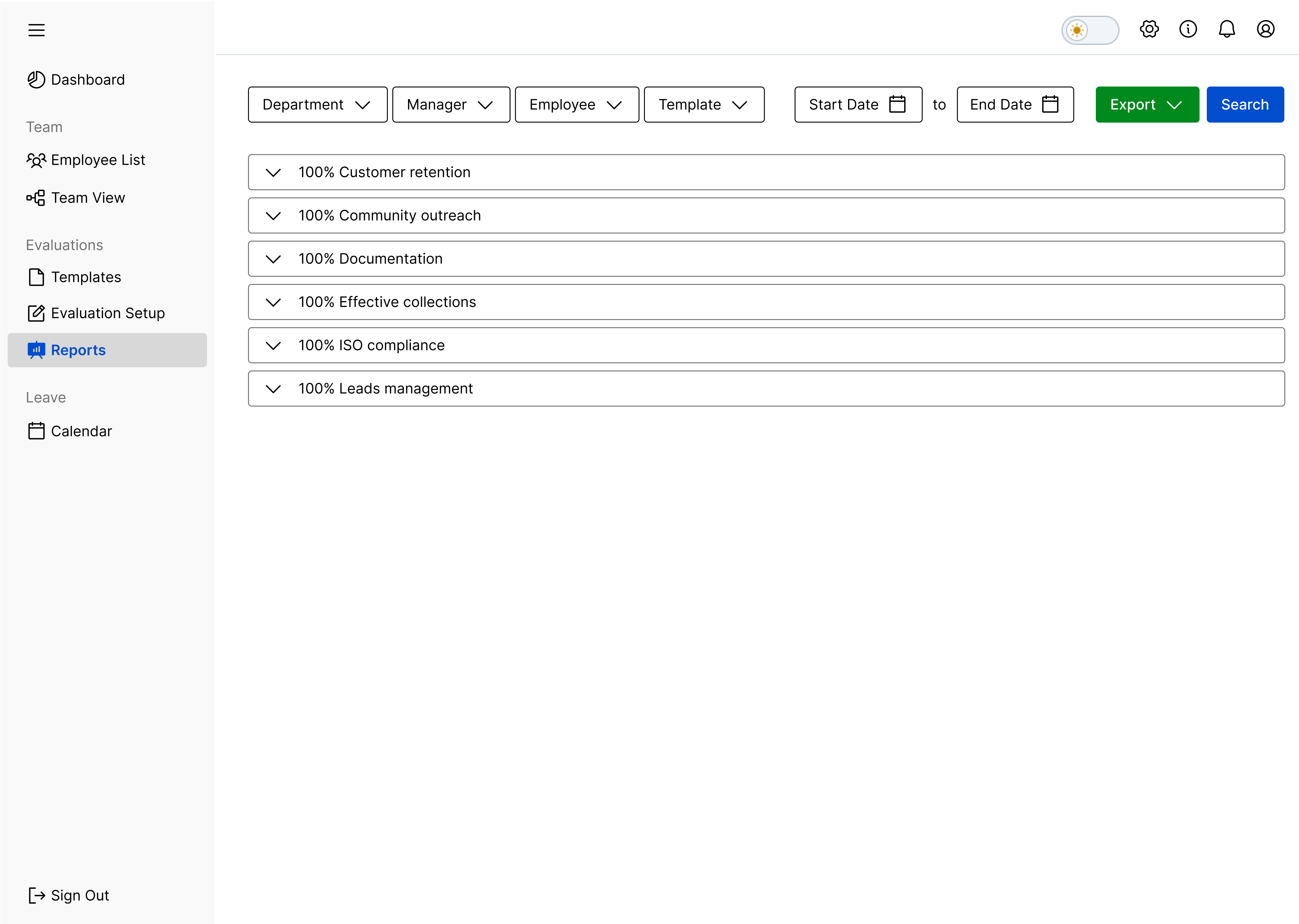
Reports- Users can refine reports using filters such as department, specific employees, templates, and time periods. Once filtered, reports can be exported for further use. In this section, the user interface was streamlined for consistency, and thoughtful use of whitespace was applied to enhance clarity and overall usability.
Payment- This was also identified as a significant user pain point. To improve the experience, visual hierarchy was introduced to emphasize key information such as the total amount and available payment options. Previously, payment methods were presented as ambiguous buttons with unclear labels and no supporting context, leading to confusion. The redesigned interface features a clearly defined primary call-to-action, providing users with clarity and confidence to progress through the payment process.

Enhanced Sidebar Navigation- in this redesign the sidebar menu has been optomized to provide a clearer and more intuitive navigation experience. The new structure consolidates key areas of team, evaluations, and leave into organised categories, helping users quickly navigate to their next task, or find the information they need.
To de-clutter the navigation further, profile, organization, notifications, and support were moved to the top navigation. The new side-bar menu not only enhances usability but also accomodates the growing scope of the platforms features.
.gif)
The redesign of the Retrain product provides companies with more comprehensive, data driven experience, empowering them to better track employee performance and have a streamlined process. Currently in development the product is due to launch end of May 2025. This project highlights my ability to tackle complex UX/UI challenges and deliver thoughtful, user-centered design solutions that significantly improve user experience.
This project is still ongoing. For the V1 release, we focused on solving the most pressing pain points due to time constraints. We’re now working on smaller improvements we couldn’t get to initially and will continue refining the design once we’ve gathered more user feedback after launch.

Have some spare time? Explore some of my other projects or check out my social media below :)