GreatSoft is a CRM software solution tailored for accounting practices and firms. While the desktop version was widely used, the original mobile application (created in 2019) suffered from low engagement, limited functionality, and outdated design- ultimately leading to its removal from the app store.
As part of a real-world design project, I worked closely with the Product Manager at GreatSoft to bring the GreatSoft mobile CRM app vision to life. The goal was to introduce a simplified, modern, and user-friendly experience that aligned with client needs and business goals. This case study showcases my end-to-end UX/UI process — from wireframes and iterative design to visual refinement, dark mode implementation, and developer hand-off.
The primary goal of the GreatSoft mobile app design was to introduce a modern, user-friendly experience aligned with the current CRM desktop solution. Key objectives included:

Rather than overwhelming users with every desktop feature, we focused on core functionality most relevant to mobile usage. To begin, the Product Manager and I co-created wireframes, taking inspiration from the existing CRM platform while streamlining it for mobile interaction. I then developed iterative prototypes in Figma, adjusting layouts and flows based on feedback from the PM and stakeholders.
The visual redesign introduced a more professional, yet engaging aesthetic. Key enhancements included:
The biggest challenge was condensing a complex, customizable platform into a simplified mobile experience that could serve a diverse client base. To overcome this, we prioritized flexibility and focused on foundational features, leaving room for future scalability in later versions.
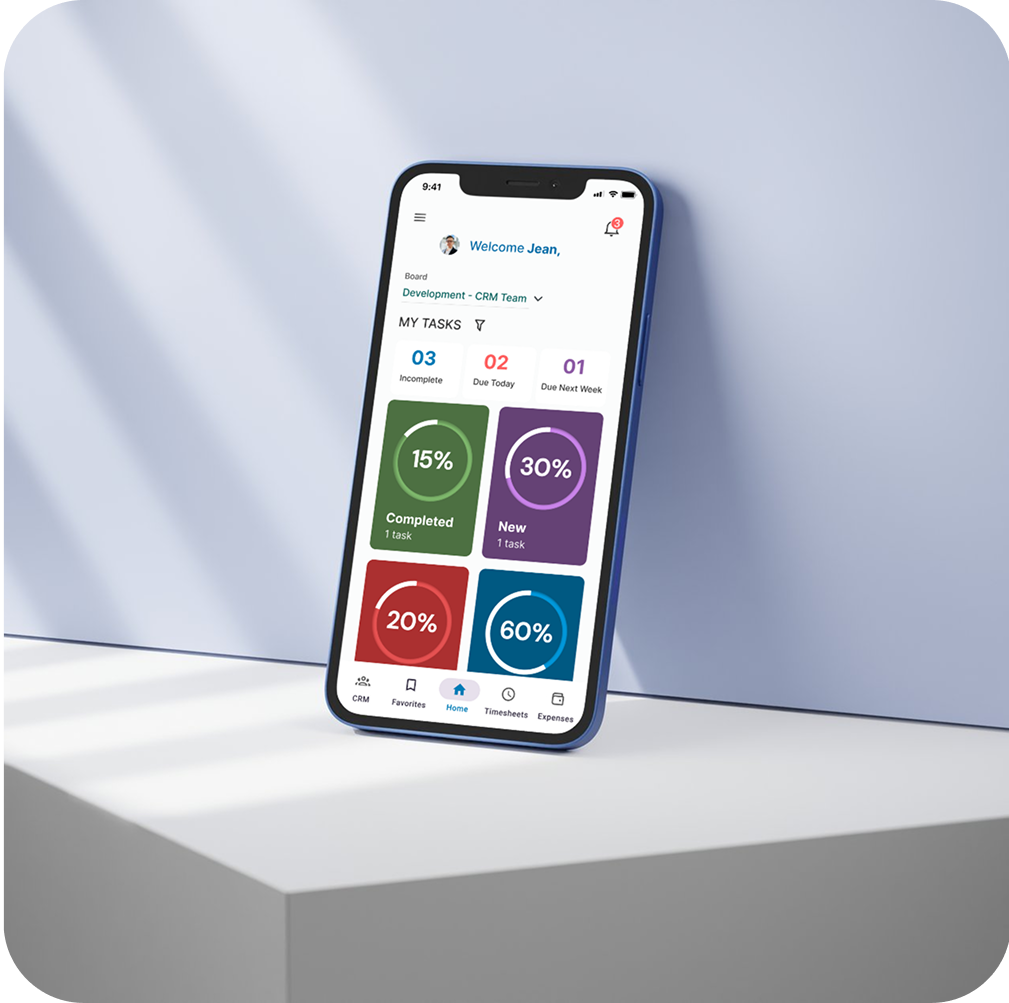
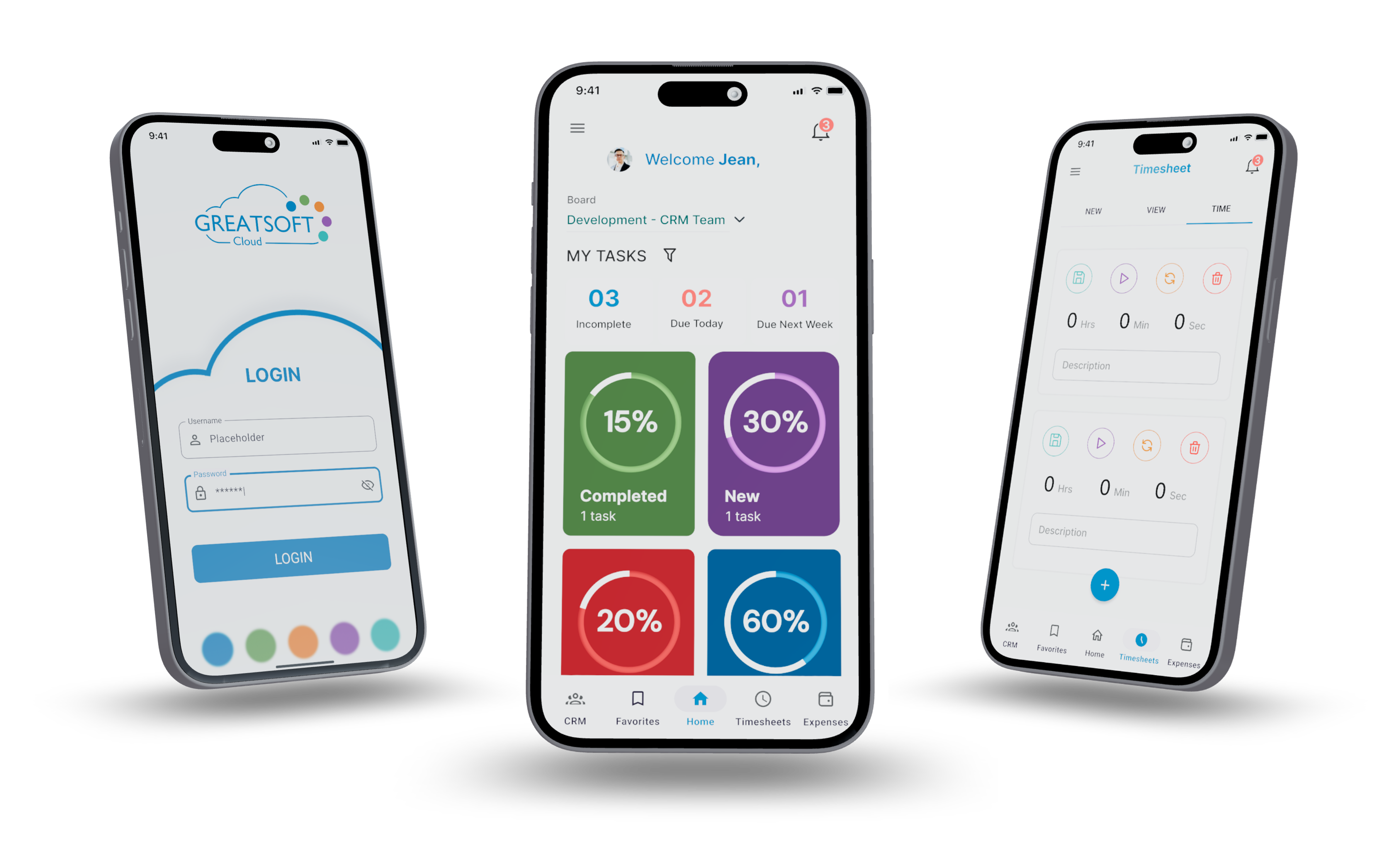
The home screen became a key focus: originally planned as a pie chart dashboard, I opted for interactive task cards to simplify comprehension and navigation. These allowed users to filter tasks by status—completed, in progress, or new—improving both clarity and engagement.


The biggest change to this screen was the task breakdown view. Instead of a pie chart, we swapped it out for cards so the user was then able to select each card to see a detailed view of their tasks. Notifications were added to top navigation.
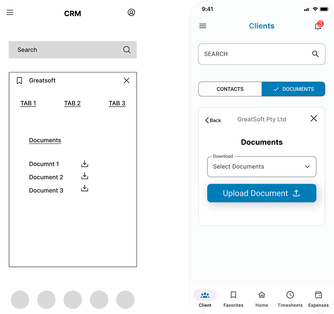
CRM was relabeled as clients as their current client did not like the term CRM. A drop down for document selection and an upload document button was added.

The client data layout was rearranged. Prioritized high-impact interactions to ensure ease of use on small screens

Tab location is moved. and a back button was added for easier navigation.


The redesigned GreatSoft mobile app reintroduced a professional, intuitive experience for clients, aligning the mobile offering with the capabilities of its desktop counterpart. By prioritizing core functionality, modern UI patterns, and accessibility features such as dark mode, the new version laid the foundation for long-term scalability. The redesign was well-received internally and marked a significant step toward restoring client confidence in the mobile experience.
This was my first professional UX project, and it taught me several valuable lessons:
"Looks excellent, pretty smooth and clean interface. The themes are a really nice touch"
"The app is quite nice, especially the dark mode."

Have some spare time? Explore some of my other projects or check out my social media below :)