Mila’s is a fictional e-commerce jewelry brand with a growing mobile user base. However, many customers—particularly new ones—feel hesitant about purchasing jewelry through an app. Concerns centered around product fit, item quality, and delivery trustworthiness. The business challenge: How might we design an experience that builds customer confidence and reduces friction in the buying process?
The design solution needed to address three key areas:
To validate assumptions and guide the design, I conducted qualitative user research through informal interviews and surveys with 8 online jewelry shoppers. Key insights included:


Based on these insights, I designed the following features to address user pain points:

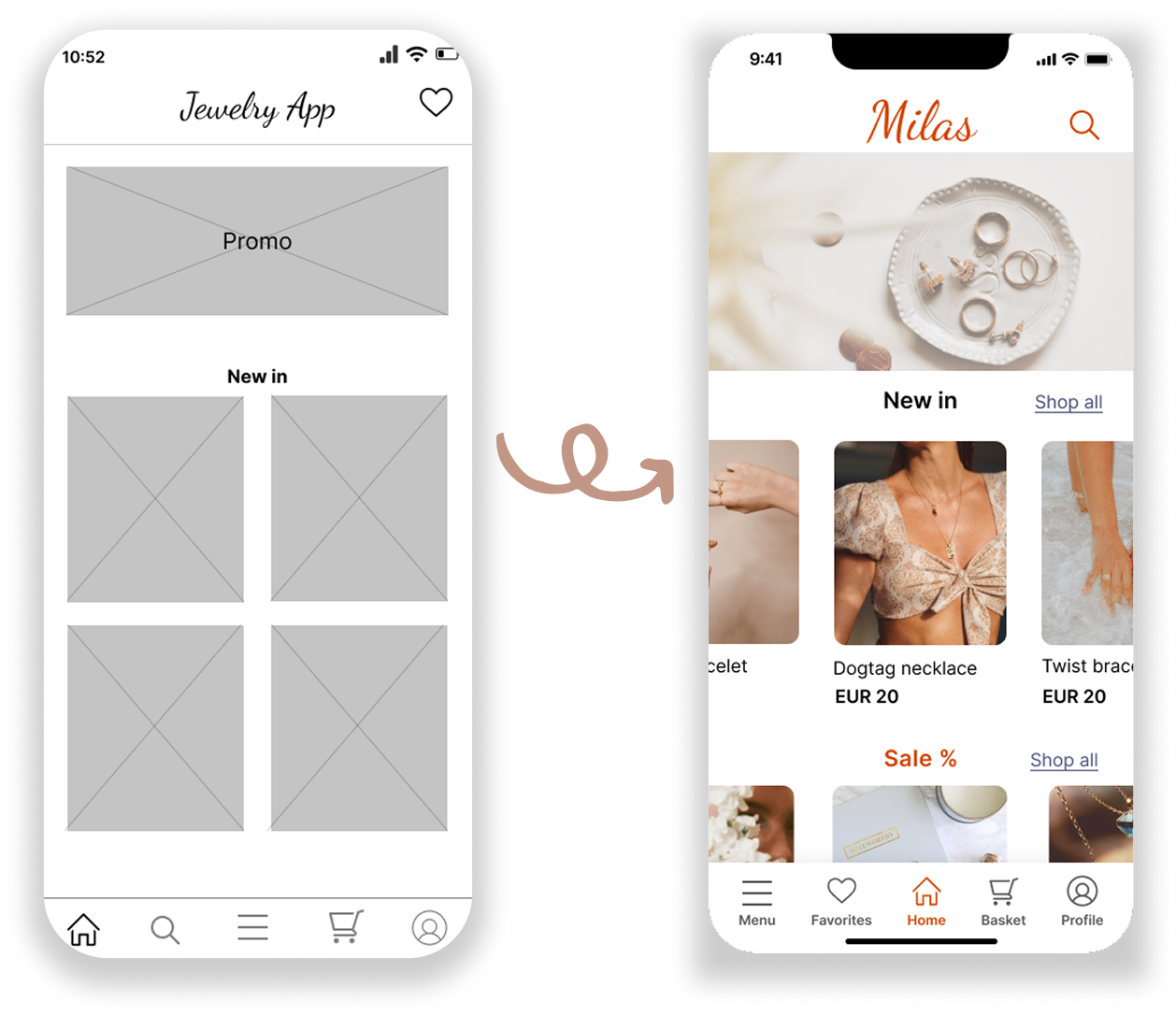
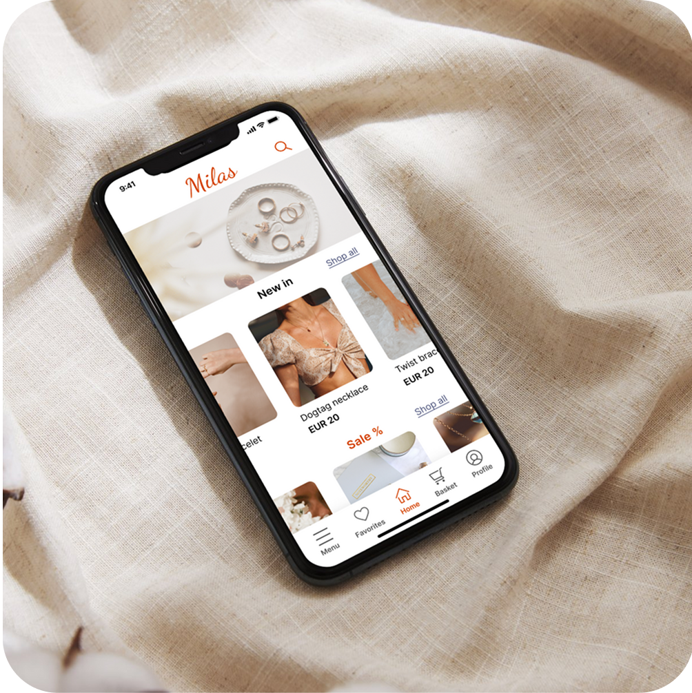
Home page items and navigation bar icons where given labels to improve user accessibility

Multiple images, and a favorite product option to improve conversion rates.

Augmented reality feature, product review, and a sizing chart are added to make the user feel more confident about sizing.

Although this was a concept project, I treated it with the same process and discipline as a real-world engagement. The result is a design that solves clear user pain points, builds trust in high-touch e-commerce, and presents a refined, branded experience tailored for mobile.

Have some spare time? Explore some of my other projects or check out my social media below :)